Case study
Accessible justice: service design for benefit appeals
Overview
The service enables users to appeal, manage and resolve a benefit appeal online, the first example of judicial online resolution worldwide.
My role
Service and interaction design lead, responsible for:
- Ideation and concept creation
- Experience maps
- Service blueprints
- User journeys
- Interaction design
- Prototyping
- Communication videos and presentations
- Stakeholder engagement
- Agile UX methodology
- UX planning and prioritisation
- Government Digital Service (GDS) assessments
I was immersed in this project, successfully taking a suite of products from Discovery to Public Beta.
The work
Discovery
The UX team set out to better understand the existing service and users’ experience of it.
- Interviews with users of the service and key stakeholders
- In the field observations
- User types defined and personas created
- Mapped out the as-is journey
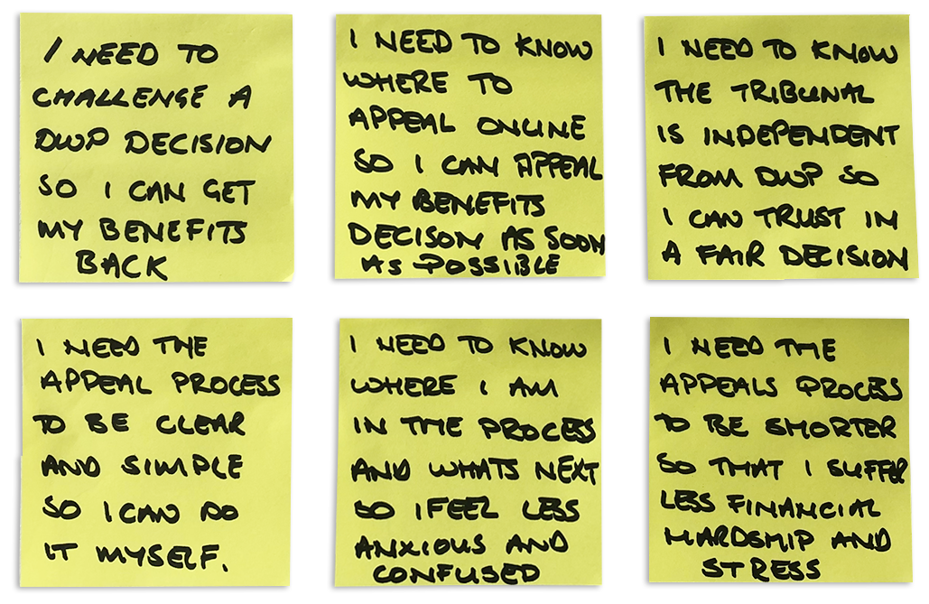
- Identified user needs, pain points and opportunities for improving the service
User groups
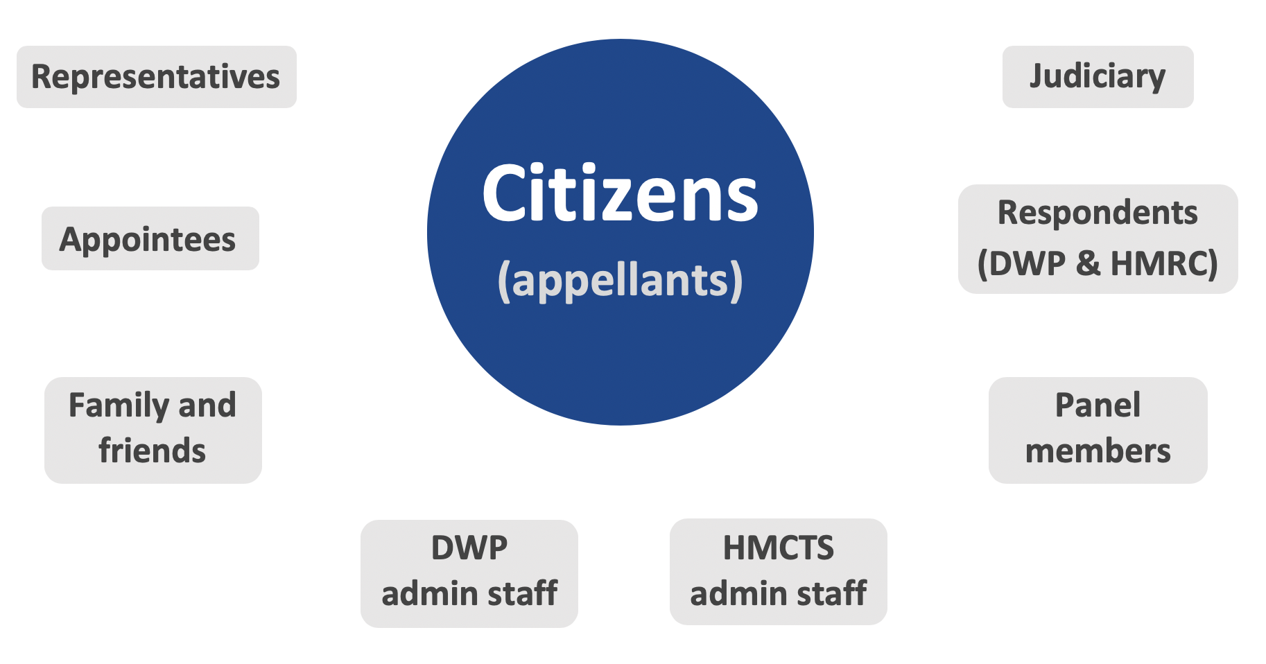
All major external and internal service users were identified and spoken with either through interviews, workshops or testing of the current service.
The primary service user is a benefit claimant appealing a decision on their benefits made by the Department of Work and Pensions (DWP). They could be supported by professional representatives (e.g. Citizens Advice), friends and family and appointees.
Understanding our users
Personas focused on design solutions, gave them context and helped validate designs with stakeholders.
Key appellant characteristics can include:
- Economically vulnerable
- Physical and mental health conditions
- Fear of engaging with authority
- Low digital skills (67% assisted digital)
- Accessibility needs
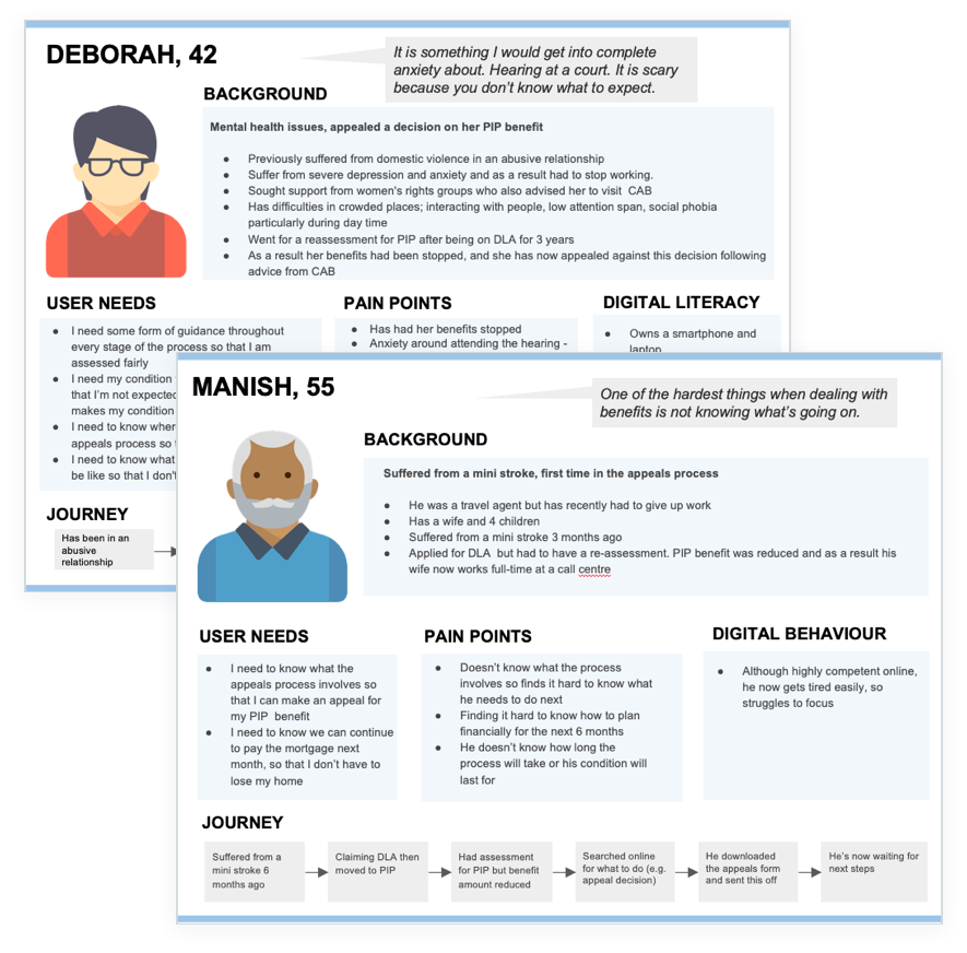
“It’s something I would get into complete anxiety about. Hearing at a court. It is scary because you don’t know what to expect.”
Design challenge and approach
Based on the insights from discovery, we set about designing a service which:
- Is easier to find
- Better understood and more transparent
- Reduces users’ fears and increases trust when engaging with the service
- Reduces time to reach a decision
A robust Agile UX process evolved design solutions based on user needs.
Concept sketches
User journeys and screen designs were sketched and quickly iterated based on user, stakeholder and team feedback.
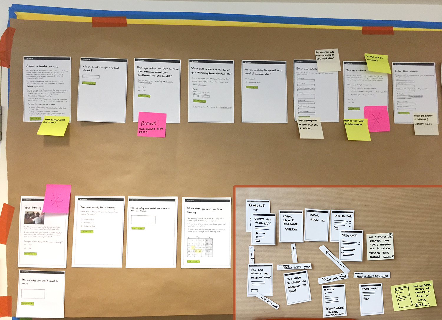
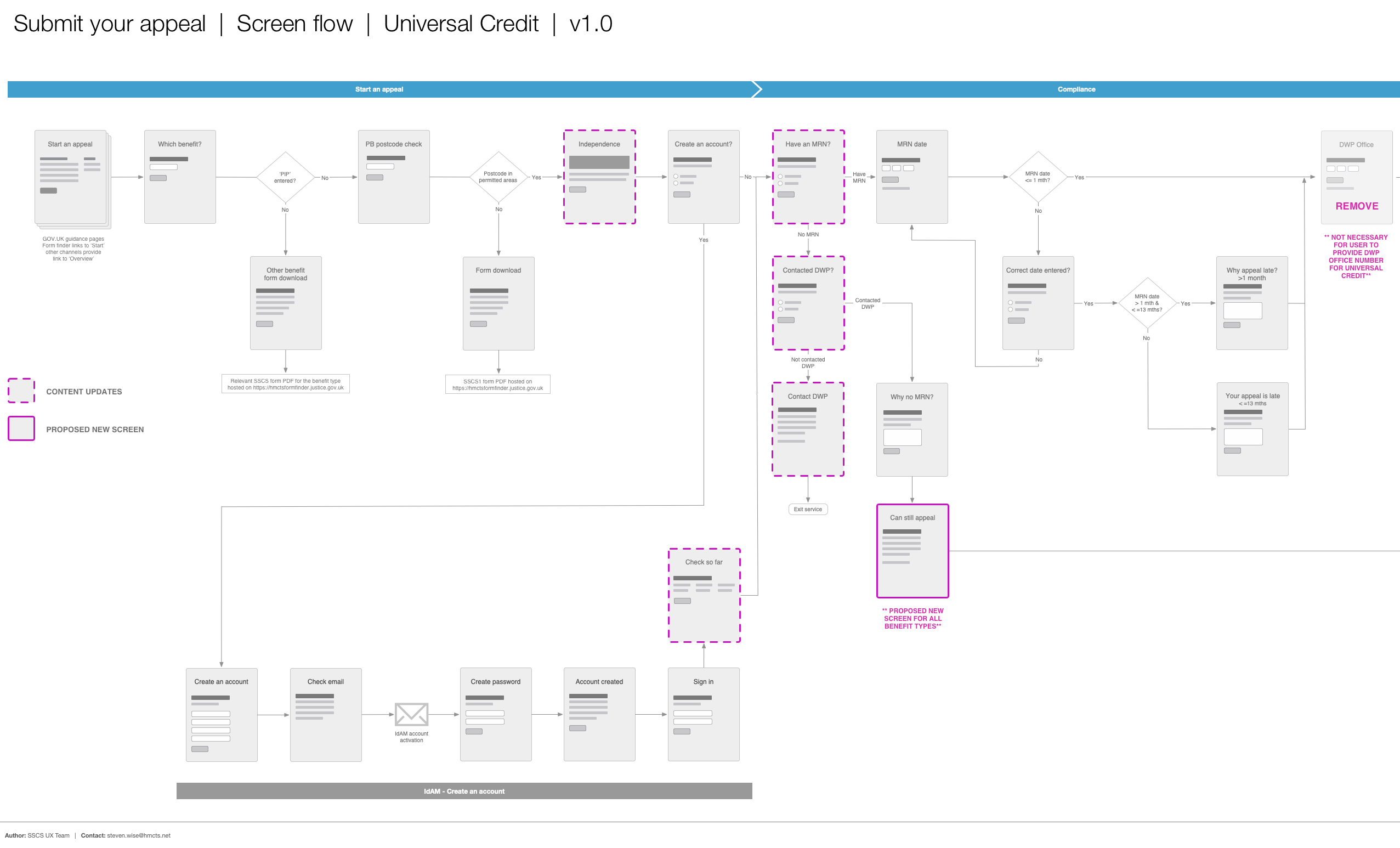
Screen flows
Detailed screen flows were created for key user journeys and specific scenarios.
These were important in validating the journeys with stakeholders and as documentation used by our development team.
Prototyping
Prototypes were created to test hypotheses for service design, screen flows and page-level interactions. These were tested with users and validated with the business. This enabled us to make informed decisions on whether to take concepts and designs forward.
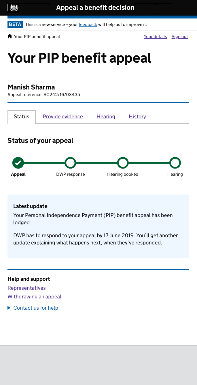
Hi-fidelity prototypes were built using the GOV.UK HTML/CSS toolkit to test screen flows and interactions. This ensured that the prototypes conformed to the core GDS design patterns and principles but provided flexibility for new patterns to be built and tested with users.
A progress bar and status update pattern were designed, which addressed users’ need to understand the process and where they were in it. Importantly for our users it needed to be clear, simple and accessible. The visual pattern tested exceptionally well, addressed a core user need, and was adopted by other government services.
User research and design iteration
The UX team tested design iterations in usability labs, in users’ own homes on their own kit and on-site with support organisations.
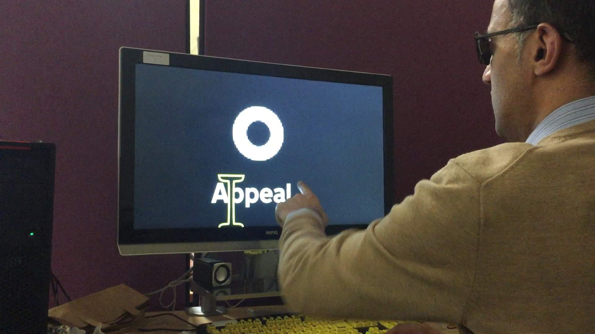
Specific accessibility testing was carried out with users with low vision, impaired movement, and dyslexia in their own homes and at the Digital Accessibility Centre (DAC) in Neath, Wales.
Feedback from research enabled designs to be iterated as part of the team’s bi-weekly Agile sprint process.
Quantitative and qualitative analysis
Once the service was in private beta, we were able to gather and analyse more data. This included regular reviews of Google Analytics and customer feedback surveys. This helped identify interaction design, content and technical issues, which we then set about resolving.
Stakeholder engagement
The UX team worked with subject matter experts within HMCTS and with judges assigned to the project. We engaged with them early, collaborated on the design and involved them in user research. This helped to win their trust and support, which was vital in building consensus for changes to the service.
We also made particular efforts to engage outside our immediate stakeholders. For example, we spoke at the Social Entitlement Judicial Annual Conference and held workshops with National Association of Welfare Rights (NAWR) members. This provided valuable feedback on design solutions and the opportunity to win hearts and minds for the service transformation.
Design solutions
End-to-end service design
Submit your appeal
Research of the existing paper form highlighted users’ needs and pain points when submitting an appeal, which we were then able to address when designing the digital service.
For example, on the paper form, users must provide their reasons for appealing and often find the large white box daunting to complete. HMCTS cannot advise users on what to write, but we looked at supporting users in how they write their answers. The design solution provides help to users by directing them to the letter that contains DWP’s decision on their appeal. We then ask them, ‘What do you disagree with?’ and ‘Why do you disagree with it?’. Users can add multiple answers to address each point in the decision. This assists users in writing a more focused and structured response.
Outcome. Tribunal judges and other panel members have reported improved quality of appeal submissions. Appellants can better communicate their reasons, and the tribunal can make better-informed decisions.
Users are more able to submit a compliant appeal, 99.8% online compared to 90% on paper. This reduces work for the tribunal and speeds up the submission process for users.
Track and manage your appeal
Users receive updates on their appeal through email and text message. They’re informed what has just happened, what’s next and when it will be done by.
Users are able to sign into their online account to check progress, provide evidence, view important information and update their details.
Users report that they feel more informed about the process and more in control of their appeal.
“I really love that idea of the texting and absolutely love that you can track your appeal.. because you’re sitting in limbo and you’re thinking oh my goodness what’s happening.”
Online resolution
Hypothesis. A key user need was to reduce the time to reach a decision on the appeal. We hypothesised that if the tribunal panel could review appeals and gather information earlier, some could be resolved without needing a hearing.
The design solutions focused on enabling the panel members to ask appellants questions early in the process. Appellants’ answers may then enable the panel to make a decision. If not, the appeal could be better prepared for a hearing, reducing the chance of adjournments (20% hearings).
Service prototype. A lo-fi pilot of the service design was conducted before any code was developed. Two tribunal panels reviewed appeals on paper and, if appropriate, issued questions to appellants or early decisions via email.
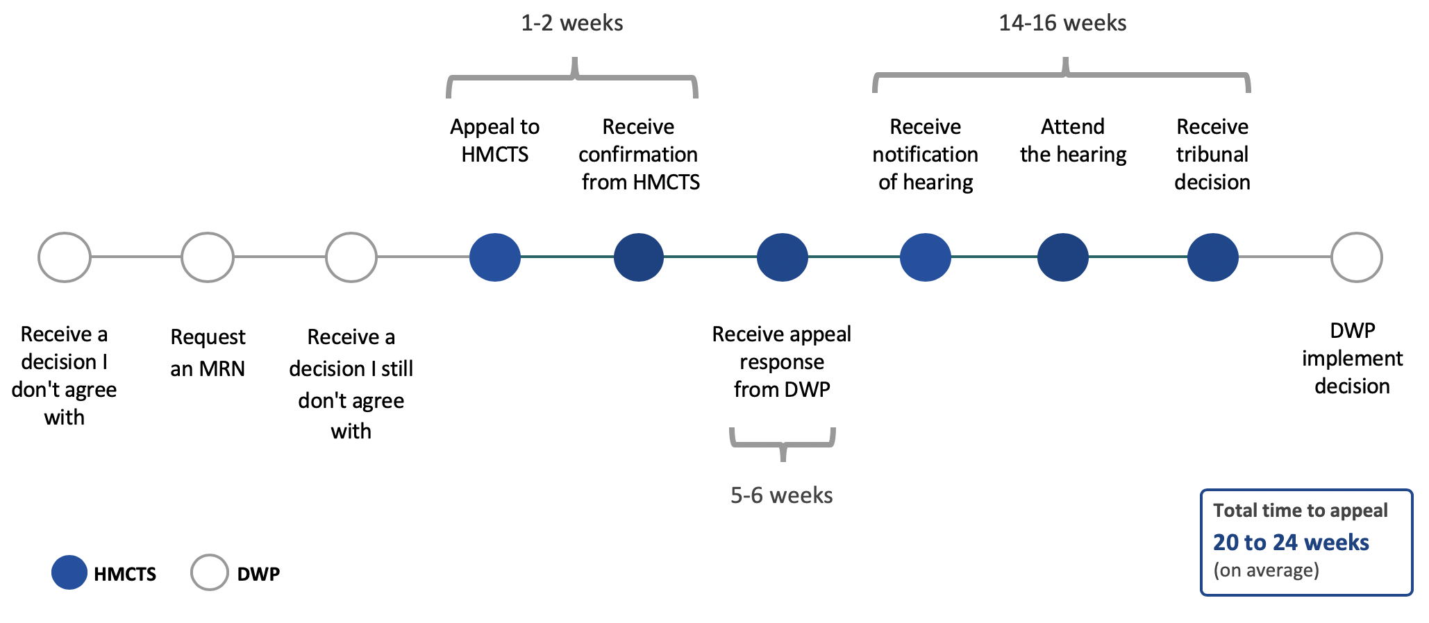
Outcome. During the pilot, 80% of appeals were resolved without needing a hearing and in at least 8 weeks compared to the 24-week average. This outcome gave the team enough confidence to develop the digital service for citizens and the tribunal panel.
Next steps. The digital online resolution service went into evaluation in a restricted private beta intending to resolve 250 appeals.
This part of the service is seen as truly transformational, it has involved a mix of change to policy, working practices and ways of communicating.
The project was recognised by BBC Legal Correspondent Joshua Rozenberg in his Gresham Lecture, where he referred to ‘continuous online resolution’ as one of the most innovative reforms in the legal field, modernising appeals for Social Security and Child Support Tribunals.